
Presented at WPCreatorCon by Bluehost on January 12, 2023

Slidedeck for “Five Biggest Website Mistakes”
Presented to Bluehost WP CreatorCon
View a PDF handout with slides and speaker notes.
Site Audits
Site Audit Report Contains
Mistake #1
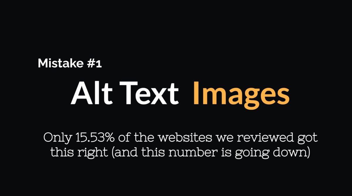
The first mistake is in the area of accessibility. Alt text, also known as “alternative text,” is a way to describe the content of an image on a website. It is important because it allows people who are blind or have low vision to understand what is depicted in the image because it is read by the screen reader. However, our review of websites found that only 15.53% of them correctly used alt text for their images. It is crucial for website owners to ensure that all images on their site have properly formatted alt text to provide an accessible and inclusive user experience.
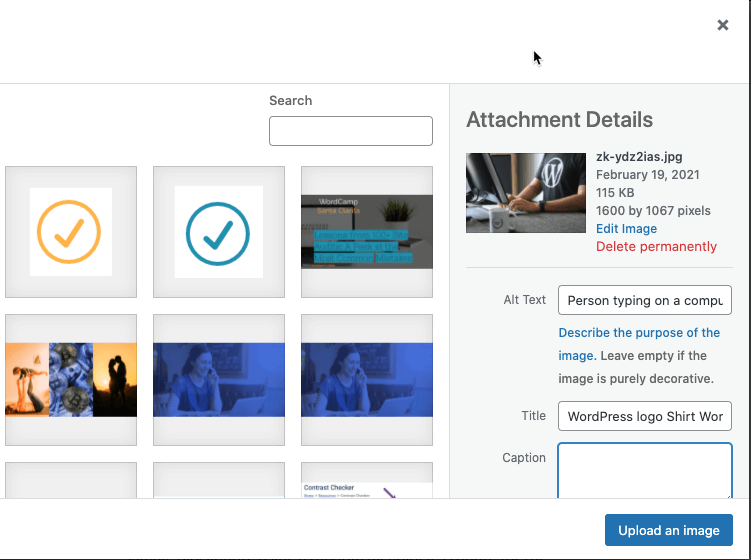
Sample Image

Alt Text for the Sample image
Tips for Writing Alt Text
In Summary
Be descriptive, yet as concise as possible. Also, think about what it would sound like if a screen reader was reading this to you.
Mistake #2
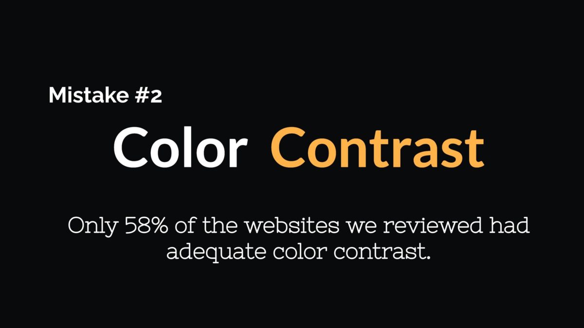
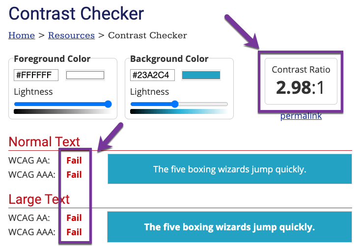
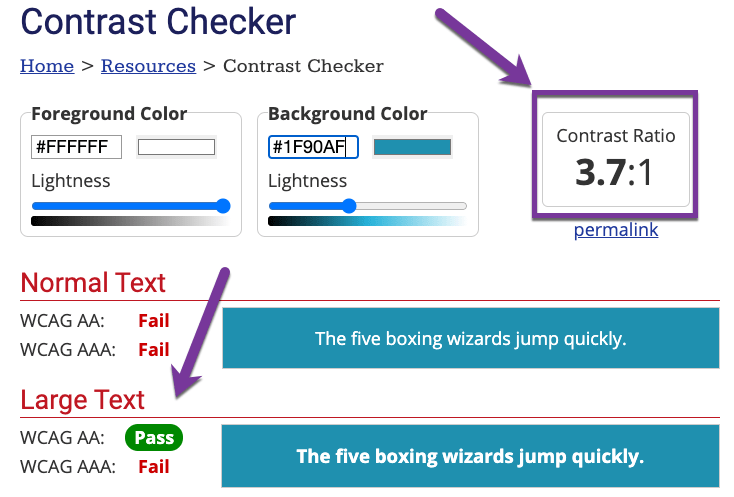
When it comes to web design and accessibility, color contrast ratios are an important consideration. The contrast ratio between text and its background should be high enough to ensure that the text is legible and easy to read for all users. For large text (18 pixels or higher), the recommended contrast ratio is 3:1, while for regular text (below 18 pixels), the recommended contrast ratio is 4.5:1. These guidelines help to ensure that text is clear and easy to read.
A Tale of Two Buttons

The button above is a screenshot of a button. It is not a clickable button.

The button above is a screenshot of a button. It is not a clickable button.
Doesn’t Meet WCAG-AA
Meets WCAG-AA
Additional Accessibility Information
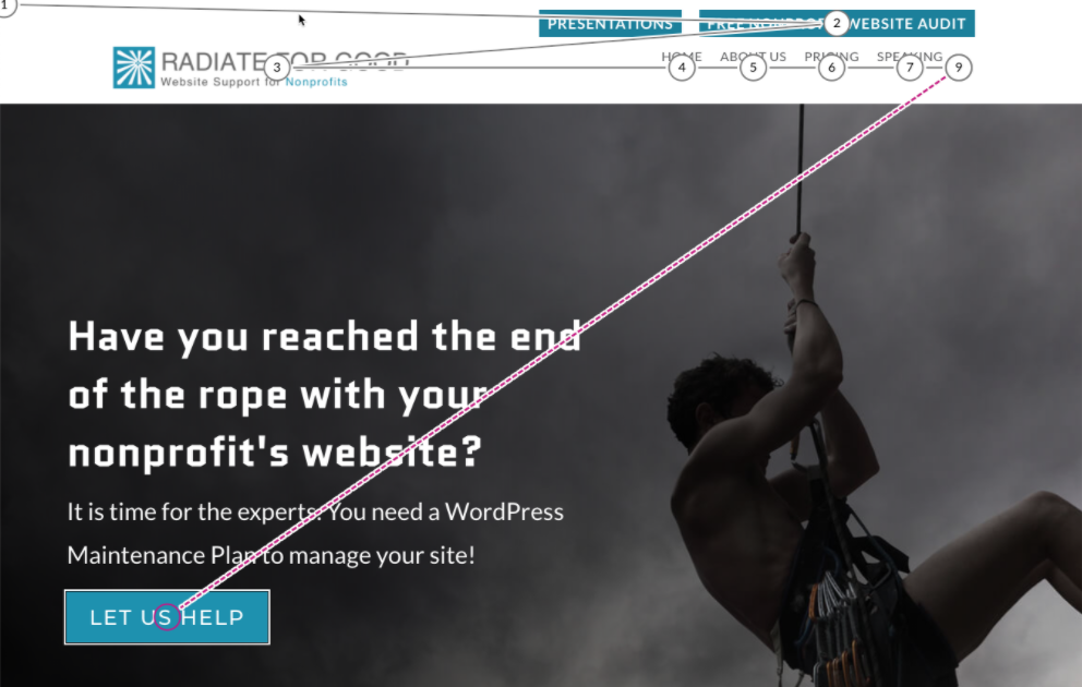
Tab Navigation
All websites should allow a user to fully navigate the site on a keyboard without using a mouse. This means that all dropdowns are accessible by “tabbing” through the site.
WARNING – A common issue is pop-ups where the pop-up is unable to be closed with a keystroke and requires a mouse click.
Content Hierarchy
Content hierarchy refers to the structure and organization of a website’s content. When the website’s content uses headings in the proper order, it makes the website more accessible to users who rely on a screen reader.
Content Structure in Proper Order
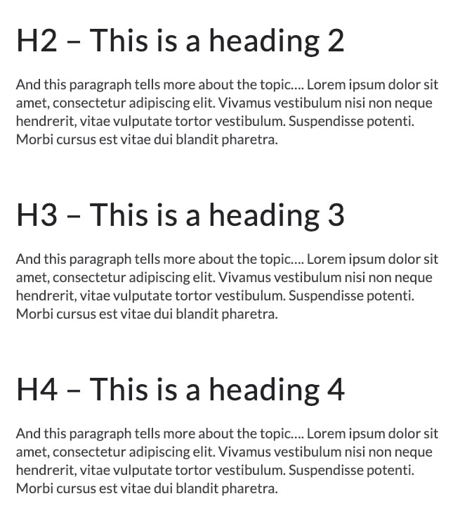
The above text is a Screenshot that shows headings in proper order.
Content Structure Out of Order
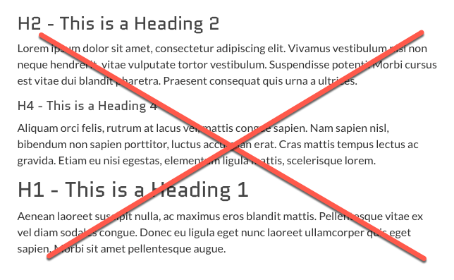
The above text is a screenshot of headings used in an improper order.
Accessibility Tools and Resources
Color Tools
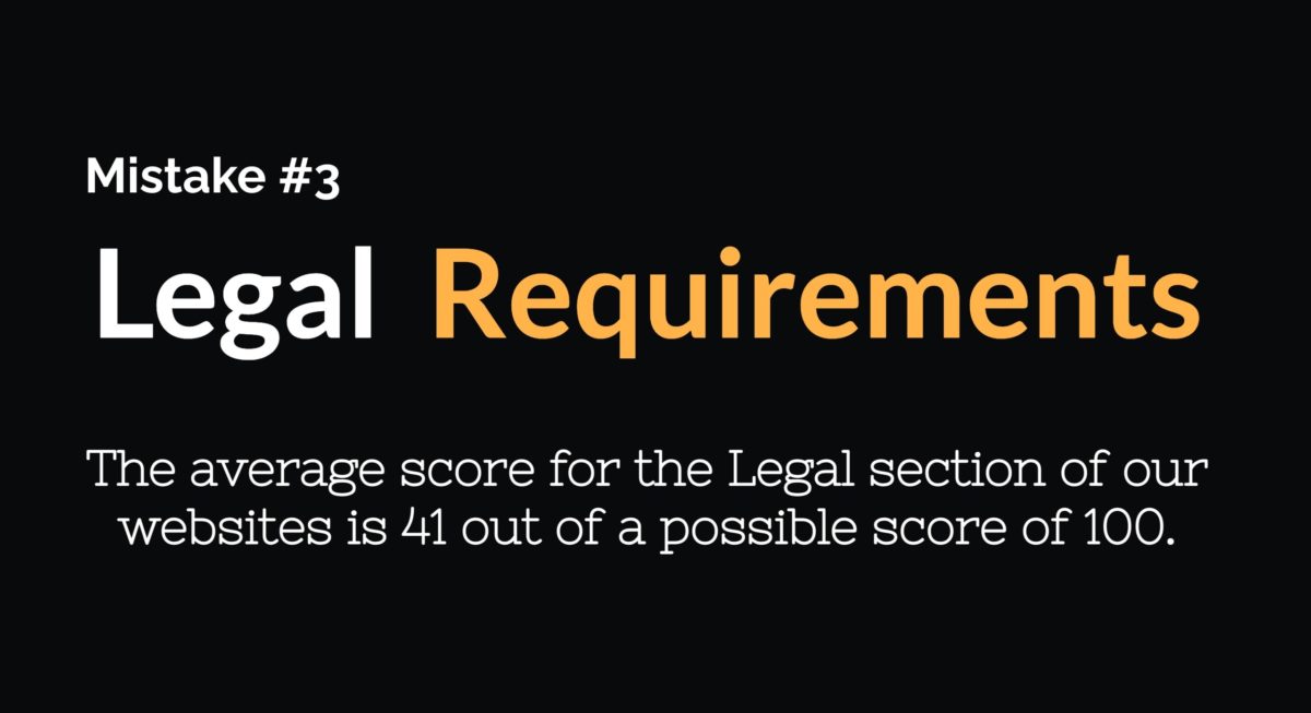
Mistake #3
Mistake #4
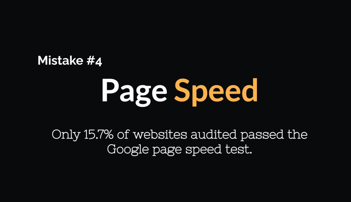
Only 15.7% of websites audited passed the Google page speed test.
Website page speed is important because it can affect the user experience of your website. If a website takes too long to load, users may become frustrated and may leave the website before they have a chance to engage with the content. In addition, page speed is a ranking factor for search engines, so a faster website may have an advantage in search results over slower competitors. Page speed is also a VERY complex art. There are multiple factors that contribute to a site’s page speed so it is important to know that there is not one magic pill that solves everything.
Quick Tips for Improving Page Speed
Mistake #5
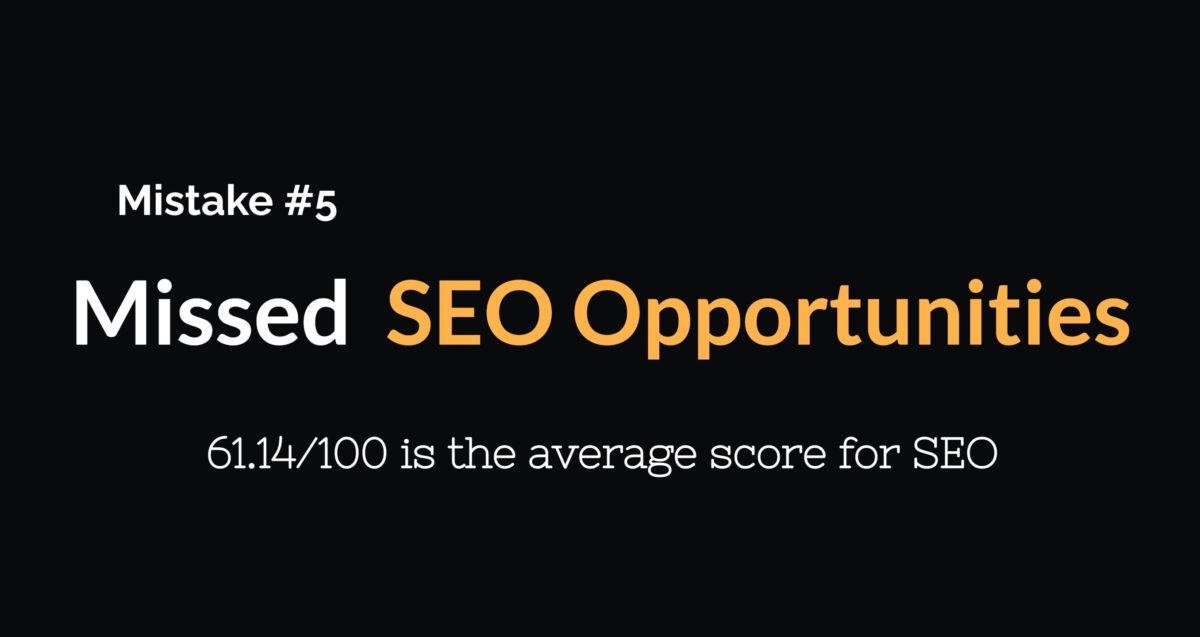
SEO stands for Search Engine Optimization and it is the art and science of optimizing your website to rank higher in search so that you can increase the traffic to your site.
Quick Tips for SEO
SEO Resources
Bonus Information
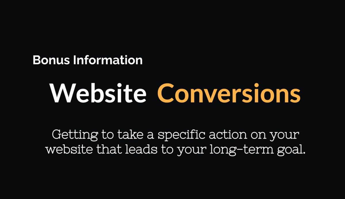
Website conversion is about more than just getting someone to click a call to action button on your site. It is about developing a comprehensive and cohesive strategy that aligns the actions you want your website visitors to take with your long-term goals for the website.