Images Can Make (or Break) Your Site
Try to imagine this particular post written in all text without any images.
The content would be boring, hard to follow, and simply “not fun”.
When you prepare your images for your website properly, you will save time and create better content, a better user experience, and a higher-performing page. While it takes extra time and attention to detail, it will pay off in the end.
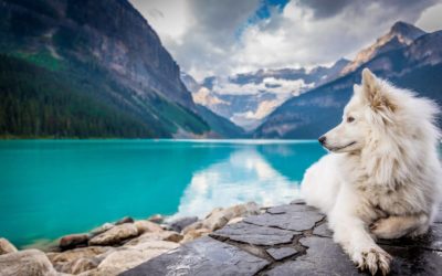
And who can’t resist a beautiful dog in front of a picturesque lake in the Canadian Rockies? 😃
Images Matter!
Finding Images
Free and Paid Stock Image Websites
Free/Freemium
Unsplash – Our favorite free option for stock photography. A bonus to Unsplash is the free plugin available in the WordPress repository that uploads the images directly to your site from the admin panel.
Other free favorites sites for free stock photos
Premium/Paid
Deposit Photos – Our favorite location for paid stock images. We like to purchase a pre-paid credit allowing us to download images from this prepaid account as needed.
Our favorite paid stock photo sites
Selecting the Right Image
All images ARE NOT created equal!
Selecting the right image is an important part of preparing images for your website.
There are FIVE MAIN CONSIDERATIONS you must ask when selecting the right image for your website.
1. What is the aspect ratio of the image?
In this example, we see two very different images. It is obvious that the picture of the leaf or the dog (on the right-hand side of the image), simply would not fit in the “very horizontal image” on the left. Likewise, the little boy on the beach or the three dogs running on the left, would not fit on the portrait size image on the right.
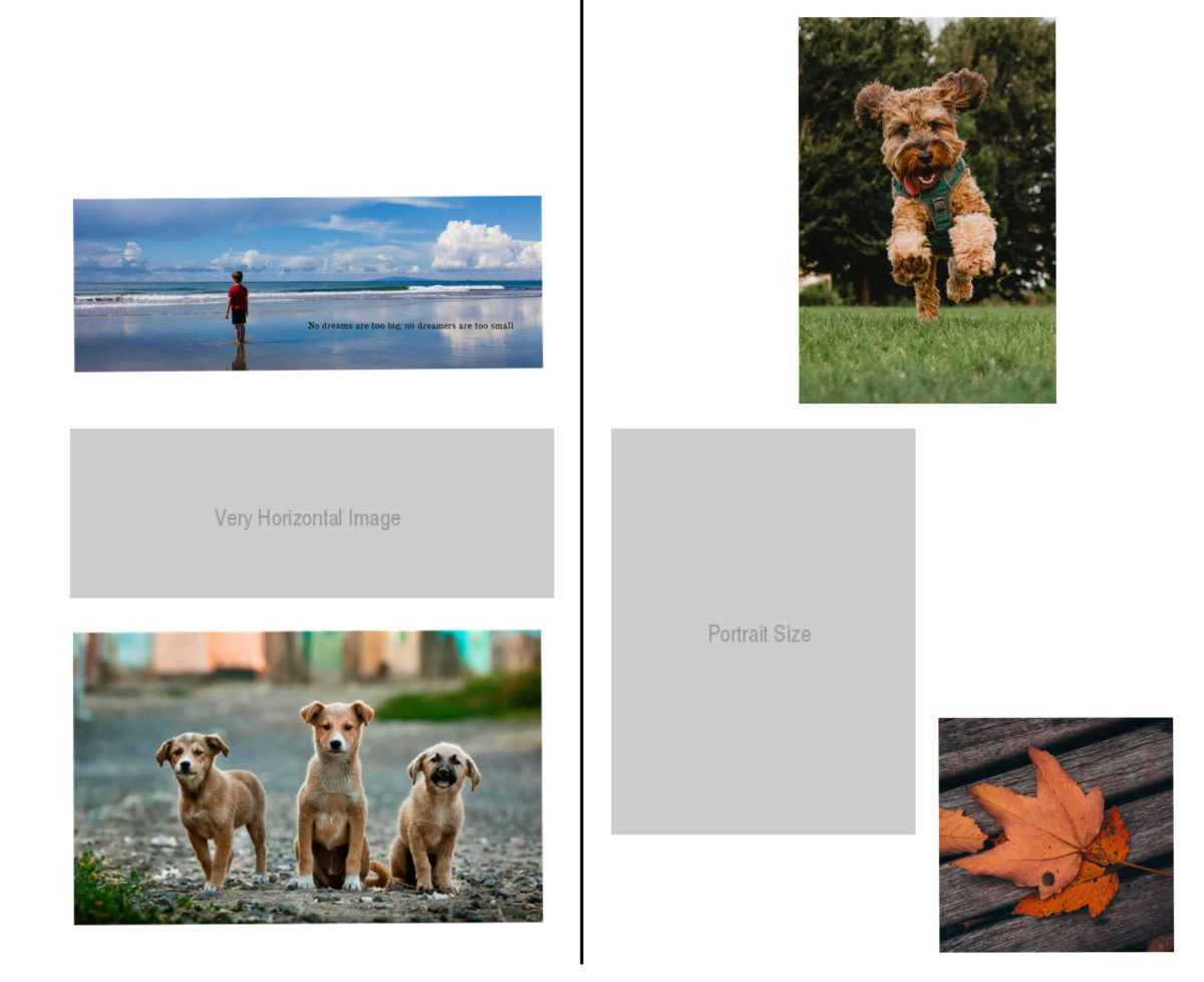
However, will the picture of the three dogs fit into the “very horizontal image”? Maybe, however, in order to fit, the image may need to be cropped at the dog’s feet, making the image at the beach the best choice.
Likewise, the image of the leaf is closer to fitting into the “portrait size” location than the horizontal one, yet this image would also need to be cropped in a way that would remove the sides of the leaf. So in this case, you would want to use the image of the dog instead.
2. Will this be a full-width “hero image”?
A hero image is a large image that sits at the top of the website in the area that is often referred to as “above the fold”. When selecting this image, it is important to select an image that is very horizontal, yet is able to crop when the page goes into a “responsive” mode. In the example image, you will see that the image on the left is a standard desktop size and the hero image is wide. But on the “tablet” view on the right, that hero image is narrower and we lost a part of the computer on the left and the book on the right.
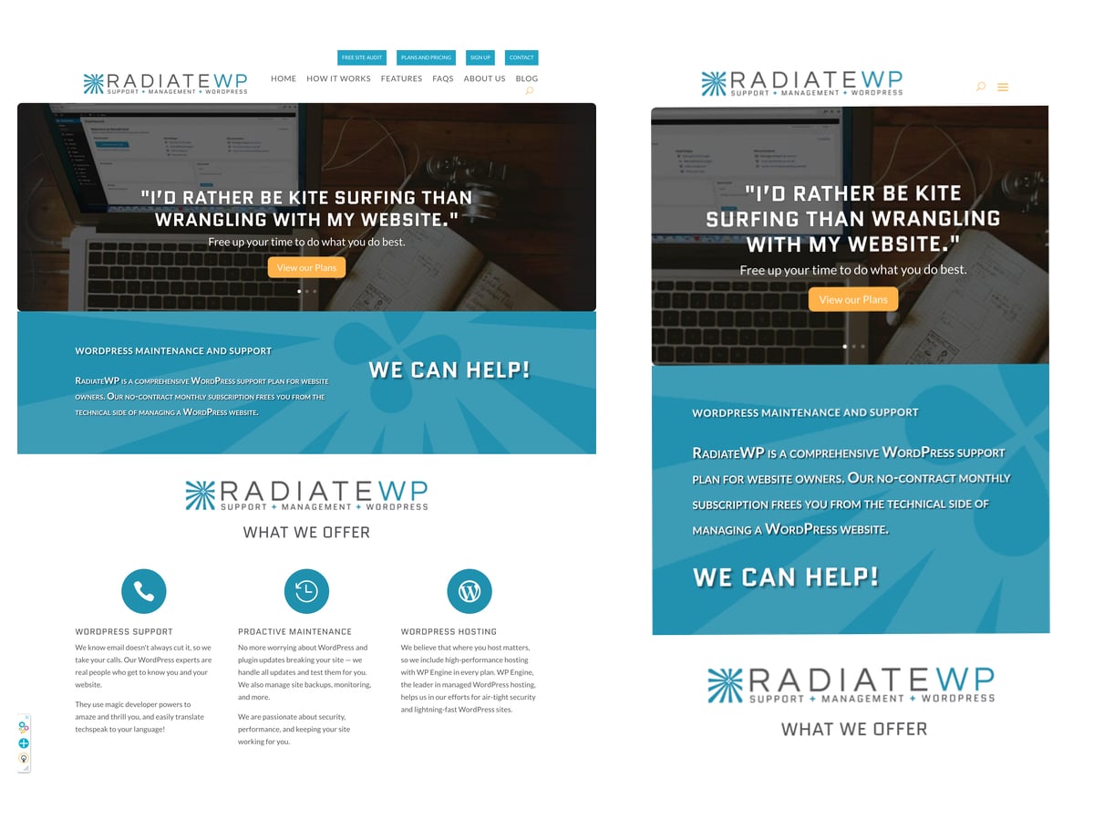
When you select a hero image, you should select an image that is not tightly cropped and can be zoomed in as it moves through the desktop to tablet, to mobile views. See #3 below.
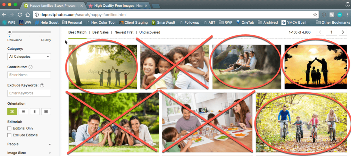
3. How well can my image adjust for responsiveness?
When choosing a large image (like the hero image mentioned above) it is important to leave room on the edges. The images with an X would not work because they are too tightly cropped and as the image scales, it would chop off the sides. The images with the red circle have a much better chance of working in such a space because there is room on the perimeter of the image for scaling without cutting off important parts of the image.
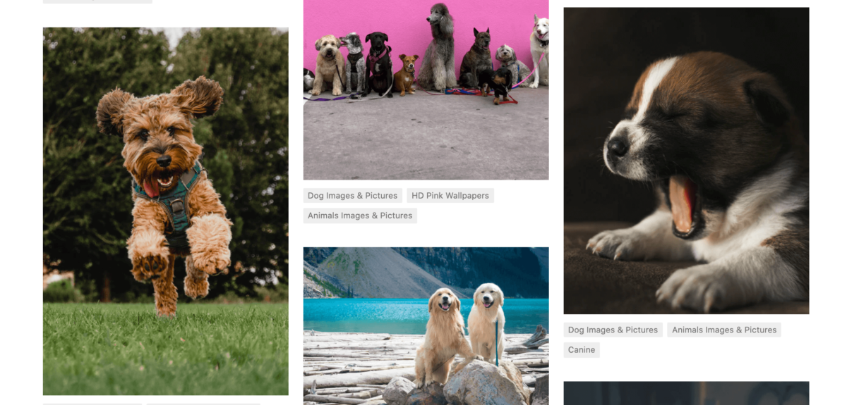
4. Is the color palette “on-brand”?
These four images from Unsplash show how the color palette of each image differs. The Image of the puppy yawning or the dog hopping would fit well into a page and brand that uses warm images. The two dogs by the lake have a color scheme that is cooler in appearance. And the image of the dogs in front of the pink wall would go well in a site that uses bright and vibrant colors. Selecting the color palette is one of the steps to preparing images for websites.
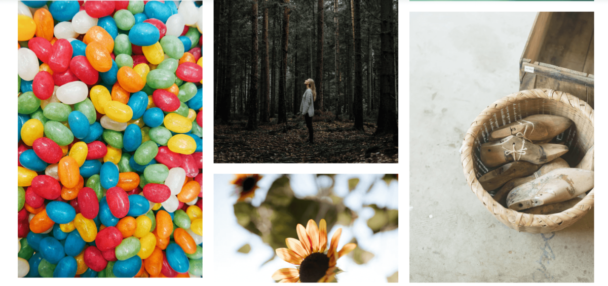
5. Is the mood “on-point”?
Another example of images from Unsplash shows four images with very different moods. You see bright and joyful colors in the image of jelly beans to a more thoughtful and solemn picture of a woman alone in a forest in a quiet moment.
It is important that the mood conveyed in the image is consistent with your brand as well as your particular content and purpose.
This post is part one of a two-part series. Part two includes details on sizing and composition, SEO, and handy tools that help in preparing images for websites.
RadiateWP is a monthly service that handles all of your WordPress website needs. With one of our management plans, you can rely on our team to handle all of your WordPress support. We offer various packages from the starter package up to a monthly plan that offers unlimited support.